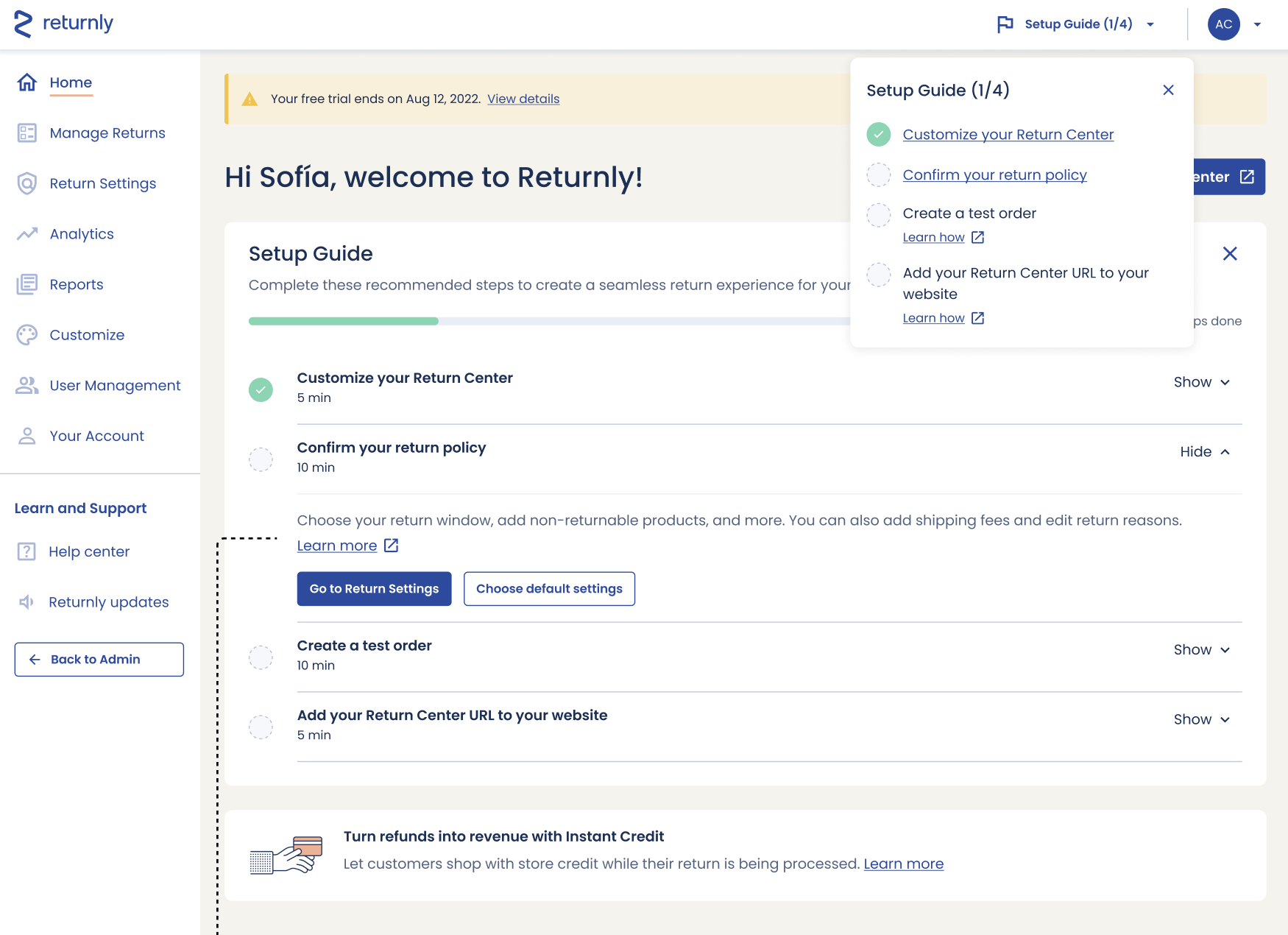
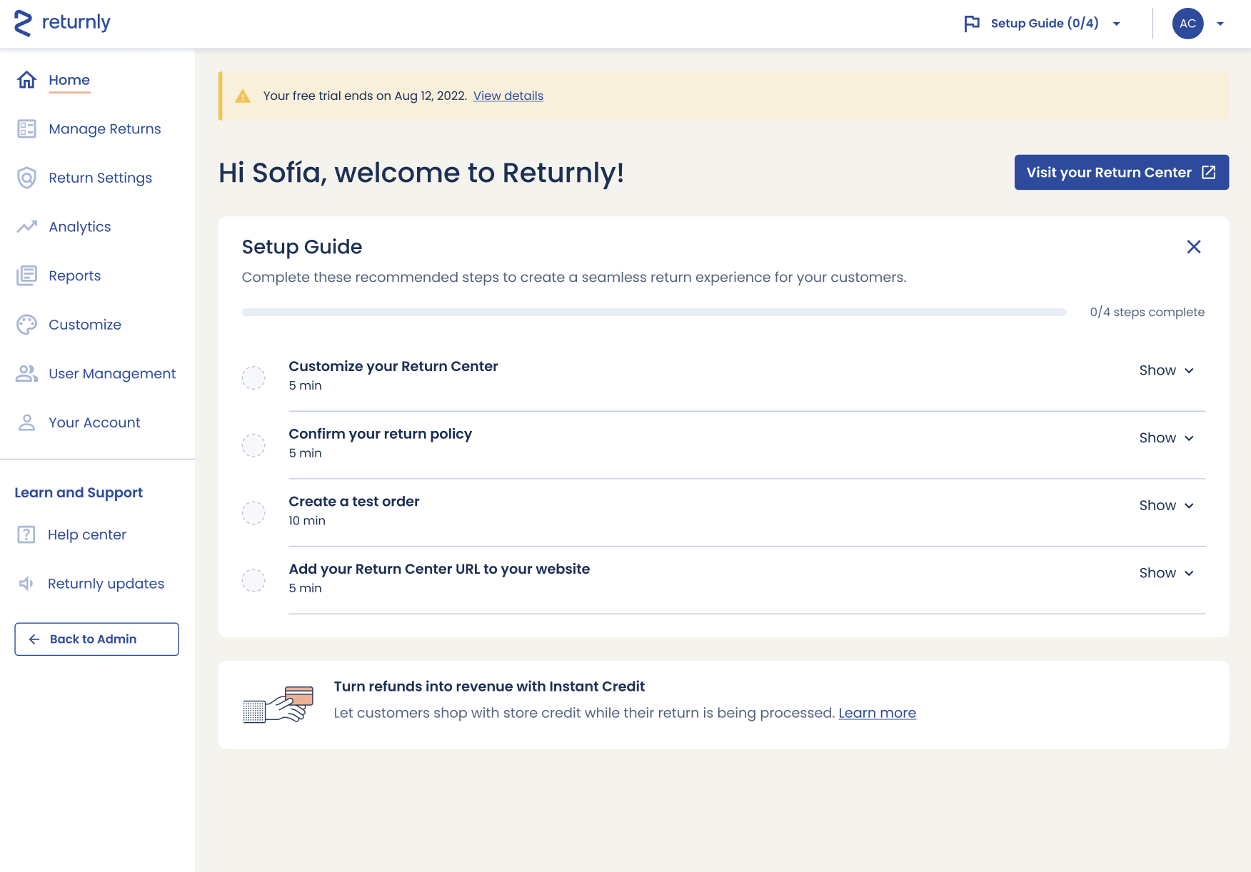
Onboarding flow
What: I collaborated with a product designer and product manager to envision a much-needed onboarding flow for new users.
Why: Users previously landed on a welcome dashboard but needed a lot of hand-holding for setting up their accounts. This project alleviated the burden on our internal support teams.
My role: User interviews, wireframing, UX writing, cross-functional collaboration
Explore

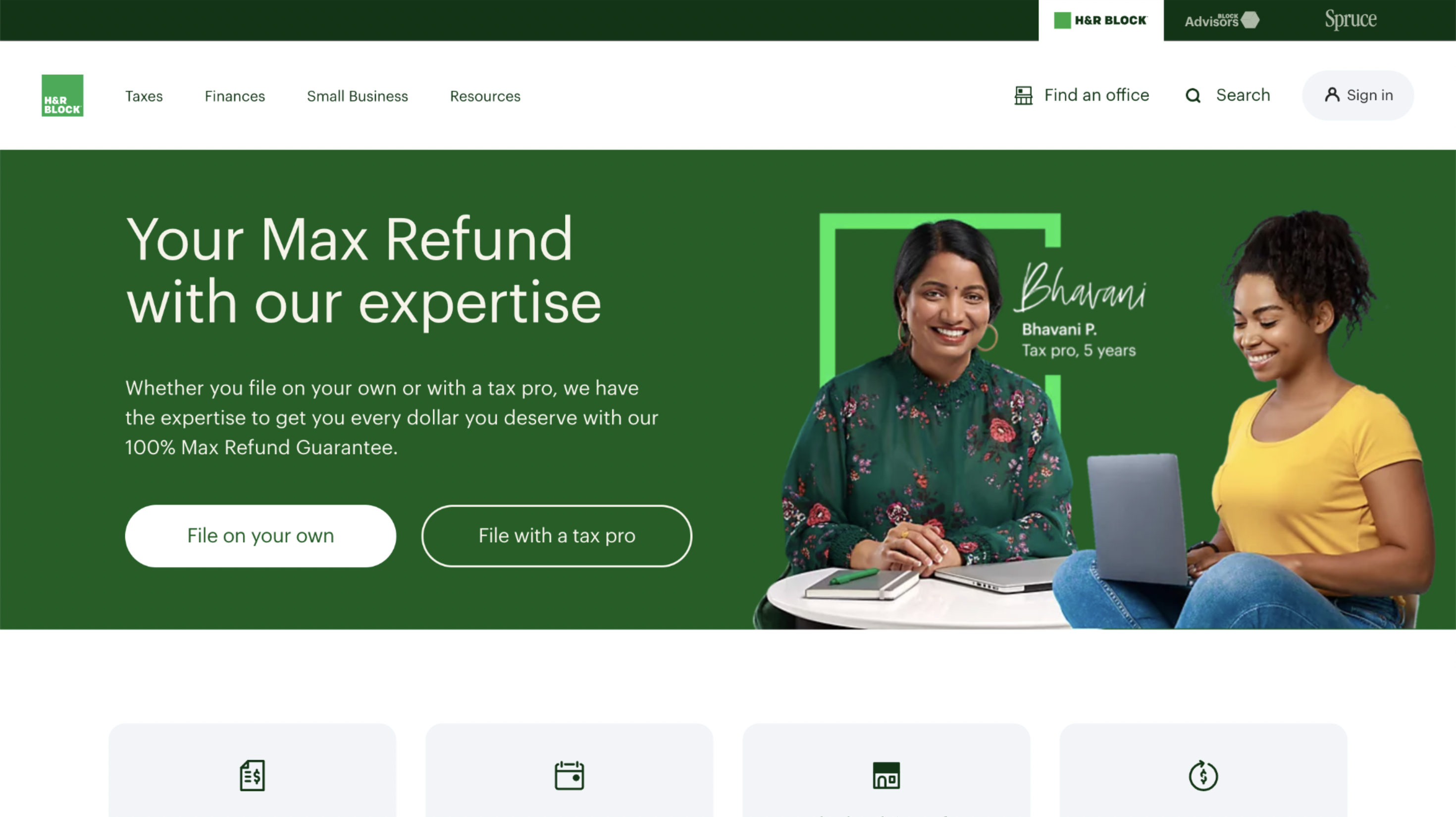
Homepage redesign
What: I collaborated with two product designers to redesign a homepage.
Why: This page received 10M+ visits per month during tax season, and the company wanted to maximize conversions year over year.
My role: Research, wireframing, UX writing, a/b testing
Explore


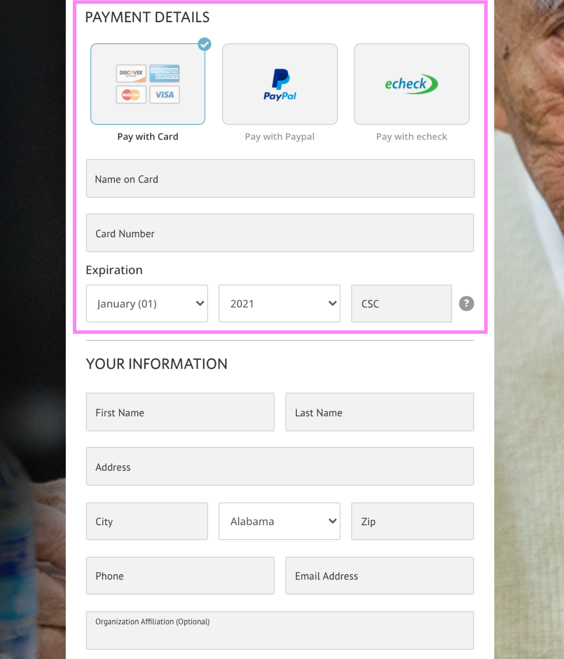
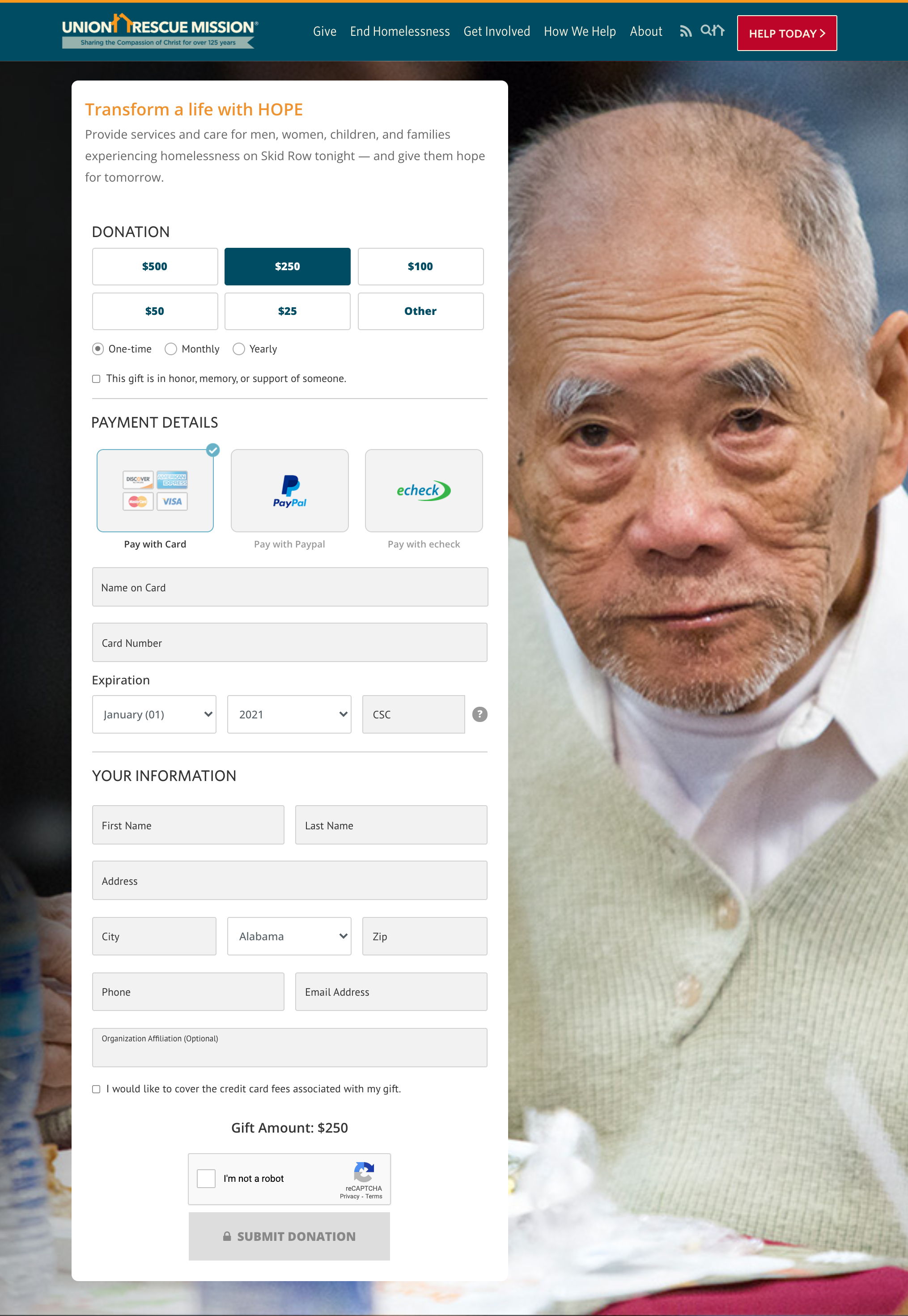
Payment flow
One simple change to a donation page resulted in 25% more conversions.
How? We moved the credit card info to the top of the donation form.
Through a/b testing, we discovered that by putting the most difficult step first, users were able flow through the process with less friction.
That also meant more donations to help end the cycle of homelessness.
Explore